One Knob Too Far. How Car Manufacturers Killed The Volume Dial and Compromised Our Safety

I recently test drove Honda Civic and Toyota C-HR. None of them had a physical volume knob. For me it’s a dealbreaker in choosing a car. Here’s why.
Touchscreens
Touchscreens conquered modern cars. The problem with them is that in order to know what you’re doing you need to look at them. Not only to find the right button but also to know what’s the effect of you touching it. They don’t give you physical feedback like pressing a button does.

It gets worse when you’re on a bumpy road or at high speeds. Touchscreen is far away and you need to take a good aim in order to hit the right button. This is especially prominent with Toyota C-HR where the buttons on the screen are tiny!
So lowering the volume on a touch screen like this: you take your hand off of the steering wheel, you look at the screen. You extend your arm and finger. Your arm is waving in the air around the cockpit as your car floats. So you need to take a long, focused look at the screen since the position of your finger in the air changes constantly and randomly. Once you touch the screen you need to see if you’ve hit the button and wait for the effect. You do all of it while there may be serious things happening on the road. Especially at high speeds.
Is Safety a Priority?
Both Honda and Toyota come packed with plenty of electronic safety features even in base models. Lane keeping assists, emergency braking and so on. It’s all fine and a good thing. But using a touchscreen to operate volume is dangerous! It makes you look away from the road. Makes you look back and forth between the road and the uninvited touchscreen. I need to focus on the screen in order to understand what’s happening there. And I’m changing the volume many times a day!
Buttons Are Not The Answer!
In Civic and C-HR you also get buttons on the steering wheel. They don’t share all of the problems of touchscreens, but one. You press a button and you wait… and wait… and wait… Then you need to stop pressing exactly at the right moment not to go too loud or too quiet. I’m usually too far. So then you have to correct your adjustment in the opposite direction. Again press and wait...
Habit & Muscle Memory
Each music track streamed from my phone or on the radio usually makes me want to increase or lower the volume. Maybe it’s just me, because I like music so much. Each time I want to talk to the people riding with me I need to lower the volume or mute. And then return to the previous settings.
Having a physical, touchable volume knob is a brilliant invention of that purpose! It’s always there in the same place. It waits for me faithfully. It always works the same way. It only has one function. My hand instinctively knows where it is. I don’t have too look away from the road to use it. My body knows how much I need to turn it in order to get the desired effect. I don’t have to think about it! The reaction of the volume is (or should be) instant to the turning of the knob. On top of that my hand feels whether I’m turning the knob or not. Those are elements of decent usability.
With touchscreens you can’t develop a muscle memory. Your body cannot rely on things being where they were. It’s like every time you use them you need to learn them all over again. This is fine in smartphones because of their portability and size. You focus on your phone and see what’s happening on the screen. In a car it’s not OK.
Pleasure
Now stereo manufacturers knew this for decades. On all kinds of stereos from low to high end, from decades-old amplifiers to the most modern ones a large physical volume knob is at the center of the system! It’s do damn important.
With a good quality stereo you get a knob that’s big, bold, heavy and precise. You turn it by grabbing it with a few fingers. It provides you with a a wonderful tactile feedback. It turns with a bit of resistance, but with confidence. It’s something that builds your trust in the stereo system. It’s how they build the impression of quality.
Nothing beats the joy of turning up the volume when your favourite track is starting!
Reasons?
So car manufacturers decided to ditch all of that pleasure and tradition. They compromise our safety. Why? I’m not sure. One thing could be savings. The thinking could go like this: since we have a computer and a touchscreen and steering wheel buttons, let’s save $5 on adding a knob.
Or maybe we have a new generation of designers that grew up with touchscreens and buttons and don’t even realize what they sacrifice. They may perceive a physical volume knob as a thing of the past. As something that was there because there was no other technology to do it? You can sometimes observe how experience of older generations disappears as the new folks reinvent things without knowing why something was there in the first place.
Either way, I doubt ditching the volume dial was requested by customers…
Car Satisfaction
On a short, daily commute I use a volume control a few times. On a longer trip dozens of times. In a car with only buttons and touchscreen I’d curse each and every time. So in this case you went one knob too far. I’m not buying a car without physical volume knob!
PS. Dear Toyota and Honda. If you really take our safety seriously as you say, put the damn volume knob back on the dash!
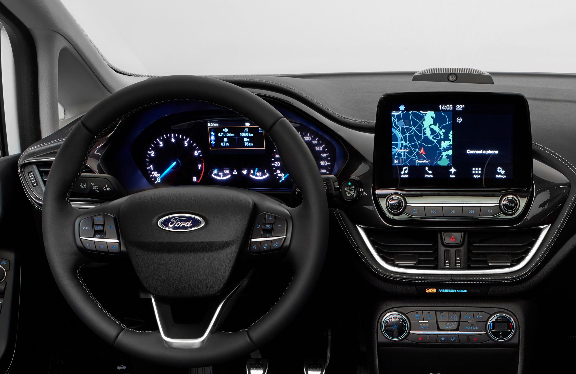
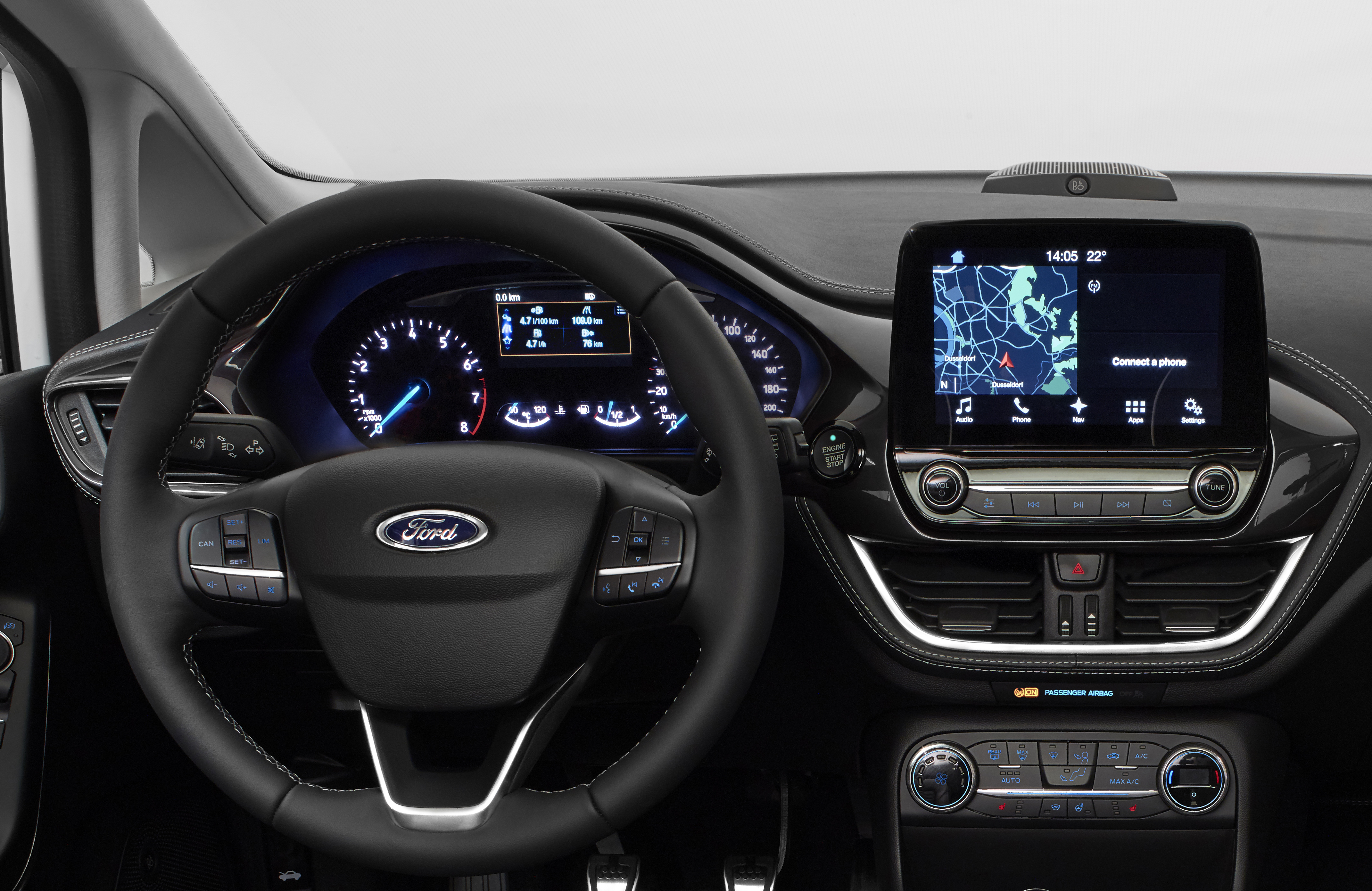
PS. The new, small and cheap Ford Fiesta, fully loaded with modern tech, comes with a decent volume knob proudly sticking out of the dashboard. It’s no coincidence :)

